Info
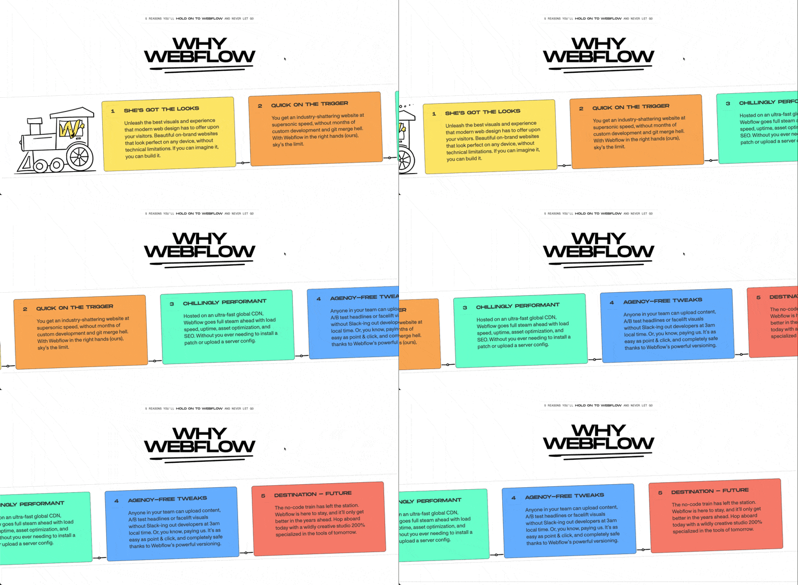
Creates a smooth horizontal scrolling section where content moves sideways as you scroll down, turning a standard layout into something more immersive and interactive. Perfect for showcasing projects, cards, timelines, galleries, or feature sections.
Required
Setup
Copy structure to Elementor
Right-click in Elementor, choose “Paste from another site,” and while the popup is open, press cmd/ctrl + v to insert the layout.
Add External Scripts
Place the scripts before the body tag of your project. If you have added them before for another setup, skip this step.
<!-- GSAP Core -->
<script src="https://cdn.jsdelivr.net/npm/gsap@3.15/dist/gsap.min.js"></script>

<!-- GSAP ScrollTrigger Plugin -->
<script src="https://cdn.jsdelivr.net/npm/gsap@3.15/dist/ScrollTrigger.min.js"></script>Add Custom CSS
Paste the code through the page or site settings, or add it via Elementor → Custom Code before body tag.
[data-horizontal-scroll-element="section"] {
  transition: none !important;
  overscroll-behavior: none;
}

[data-horizontal-scroll-element="track"] {
  transition: none !important;
}Add Custom Javascript
Paste the script through Elementor → Custom Code and set it to load after the closing body tag.
window.addEventListener("load", () => {
  if (document.body.classList.contains("elementor-editor-active")) return;
  if (!window.gsap || !window.ScrollTrigger) return;

  gsap.registerPlugin(ScrollTrigger);

  const defaultAnim = {
    scrub: true,
    snap: false,
    snapDuration: 0.5,
    snapEase: "power1.inOut"
  };

  const mm = gsap.matchMedia();

  mm.add(
    {
      isMobile: "(max-width: 767px)",
      isTablet: "(max-width: 1024px)",
      isDesktop: "(min-width: 1025px)"
    },
    context => {
      const { isMobile, isTablet, isDesktop } = context.conditions;

      const ctx = gsap.context(() => {
        const sections = document.querySelectorAll('[data-horizontal-scroll-element="section"]');

        sections.forEach(section => {
          const track = section.querySelector('[data-horizontal-scroll-element="track"]');
          if (!track) return;

          const disable = section.dataset.horizontalScrollDisable;

          const shouldDisable =
            (disable === "mobile" && isMobile) ||
            (disable === "tablet" && isTablet) ||
            (disable === "desktop" && isDesktop) ||
            (disable && !isNaN(disable) && window.matchMedia(`(max-width: ${disable}px)`).matches);

          if (shouldDisable) return;

          const panels = track.children.length;

          const snapAttr = section.dataset.horizontalScrollSnap;
          const snap = snapAttr === "true" ? true : snapAttr === "false" ? false : defaultAnim.snap;

          const snapDuration = parseFloat(section.dataset.horizontalScrollSnapDuration) || defaultAnim.snapDuration;
          const snapEase = section.dataset.horizontalScrollSnapEase || defaultAnim.snapEase;

          const getDistance = () => {
            return Math.max(0, track.scrollWidth - document.documentElement.clientWidth);
          };

          if (getDistance() <= 0) return;

          gsap.set(track, { x: 0 });

          gsap.to(track, {
            x: () => -getDistance(),
            ease: "none",
            scrollTrigger: {
              trigger: section,
              start: "top top",
              end: () => `+=${getDistance()}`,
              pin: true,
              pinSpacing: true,
              scrub: defaultAnim.scrub,
              invalidateOnRefresh: true,
              markers: false,
              snap: (snap && panels > 1) ? {
                snapTo: 1 / (panels - 1),
                duration: snapDuration,
                ease: snapEase
              } : false
            }
          });
        });
      });

      return () => ctx.revert();
    }
  );
});Publish and preview live
Some solutions only work on the live site. Always publish and test after each change, as results may not appear in the editor.
Note
This is not a true horizontal scroll. The page still scrolls vertically, but the section is pinned and the inner track is translated sideways to create the horizontal effect.
Because of this, native CSS scroll-based effects (like scroll-behavior, scroll-snap, or scroll-linked transitions) will not work as expected inside the section.
If you want to animate elements inside the track while scrolling, you’ll need to use GSAP (for example, with ScrollTrigger) on the track’s children or nested elements.
Required Attributes
Section
Add data-horizontal-scroll-element="section" to the main section that you want to turn into a horizontal scroll area.
This is the outer wrapper that gets pinned when it reaches the top of the viewport. While the user continues scrolling vertically, this section stays fixed in place and the inner track moves horizontally.
Layout setup:
- Set the section to at least
100dvhrecommended height so the pinned area has enough space and feels natural. - You can place headings, intro text, or other static content inside the section, but the moving horizontal items should stay inside the track.
- Make sure the section is not inside another element that has unusual overflow or transform settings, as that can interfere with pinning.
Track
Add data-horizontal-scroll-element="track" to the element inside the section that contains the items you want to scroll horizontally.
This is the element that moves from right to left as the user scrolls. Your cards, panels, images, columns, or content blocks should sit directly inside this track.
Layout setup:
- The track must be wider than the viewport. If it is not wider, there is no horizontal distance to animate, so the script will skip it.
- Make sure each child item keeps its width by using
flex: 0 0 auto, and by giving each item a clear fixed, minimum, or content-based width. - Prevent items from wrapping by using
flex-wrap: nowrap.
Example layouts
<section data-horizontal-scroll-element="section">
  <div data-horizontal-scroll-element="track">
    <!-- Horizontal items go here -->
  </div>
</section><section data-horizontal-scroll-element="section">
<!-- Static content (stays in place while section is pinned) -->
<div class="horizontal-scroll-info">
<h2>Featured Projects</h2>
<p>This content sits inside the section but does not move.</p>
</div>
<div data-horizontal-scroll-element="track">
<!-- Horizontal items go here -->
</div>
</section>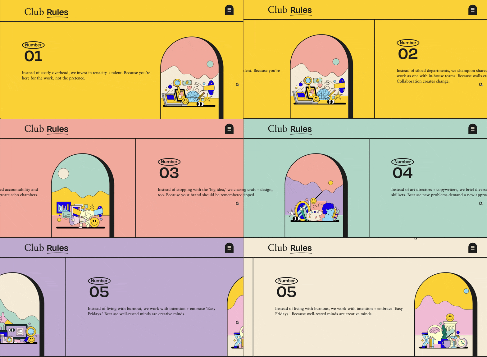
Settings
Disable on Breakpoints
You can disable the horizontal scroll on specific screen sizes by adding data-horizontal-scroll-disable="VALUE" to the section element.
Use mobile to disable the effect on screens up to 767px. Use tablet to disable it on screens up to 1024px. Use desktop to disable it on screens from 1025px and above.
You can also use a custom pixel value. For example, adding data-horizontal-scroll-disable="991" will disable the horizontal scroll on screens up to 991px.
This is useful when you want the section to behave normally on smaller devices, especially because horizontal pinned sections can feel awkward on mobile if the layout is not designed for it. Once disabled, you can freely customize the section and track layout for that breakpoint.
Snap
By default, snapping is disabled, so the scroll moves freely without locking to each panel.
You can enable snapping by adding data-horizontal-scroll-snap="true" to the section element. To explicitly disable it, use false.
When enabled, the scroll will snap between each child element inside the track, based on how many items are present.
Snap Duration
Snap duration controls how long it takes for the scroll to settle into place when snapping is enabled.
The default value is 0.5 seconds. You can override this by adding data-horizontal-scroll-snap-duration="VALUE" to the section element.
Snap Ease
Snap ease controls the motion curve used during the snapping animation.
The default value is power1.inOut. You can override it by adding data-horizontal-scroll-snap-ease="VALUE" to the section element. This accepts any valid GSAP easing value such as power2.out, power3.inOut, or none.
Scrub
By default, scrub is set to true, which means the animation is directly linked to the user’s scroll position with no smoothing. The movement feels tight and responsive, following the scroll exactly.
If you prefer a smoother, slightly delayed feel, you can change this inside the script under defaultAnim by setting a numeric value like 1 or 1.5. Higher values will add more easing between scroll and animation.
const defaultAnim = {
  scrub: true,
  };
Global Default Values
You can adjust the default behavior of the horizontal scroll directly from the script. These values apply to every horizontal scroll section unless you override them using data attributes on the section.
To change the global animation settings across all sections, edit the values inside the defaultAnim object in the code.
const defaultAnim = {
  scrub: true,
  snap: false,
  snapDuration: 0.5,
  snapEase: "power1.inOut"
};


