
.webp)


Info
Overview
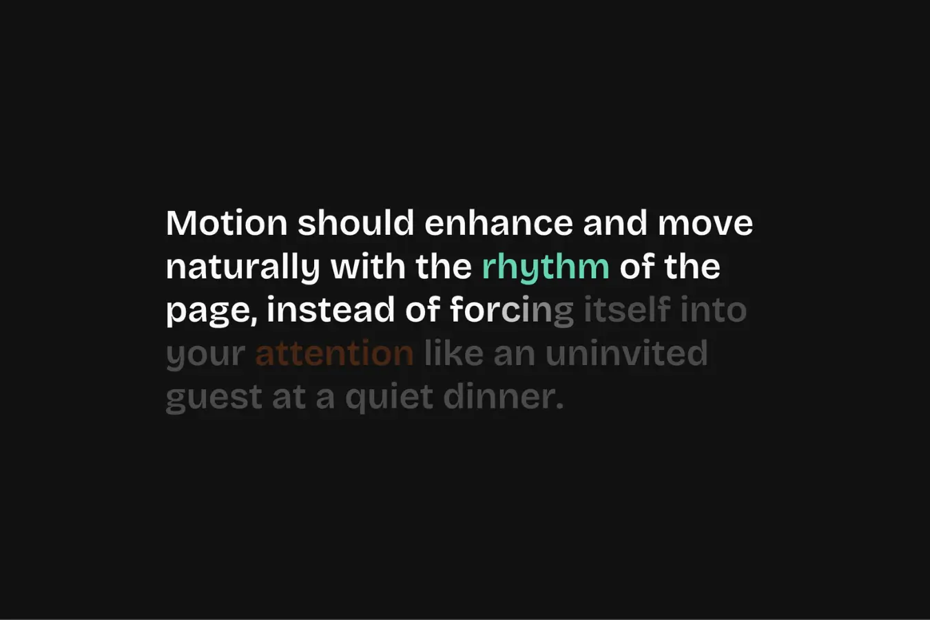
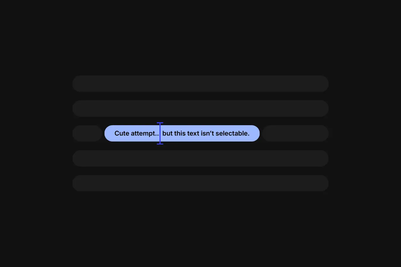
This snippet brings a subtle animation effect that reveals text one character at a time as you scroll.
Add one attribute to your text and the effect comes to life instantly.
From there, you can fine-tune the behavior using optional attributes to control scroll position, opacity, and character timing without touching the JavaScript.
It’s designed to be lightweight, easy to reuse, and flexible enough to drop into any layout without changing the core code.
Setup
Copy & paste the scripts before the </body> tag of your project. If you added them before for another setup, skip this step.
<!-- GSAP -->
<script src="https://cdn.jsdelivr.net/npm/gsap@3.14.1/dist/gsap.min.js"></script>

<!-- ScrollTrigger -->
<script src="https://cdn.jsdelivr.net/npm/gsap@3.14.1/dist/ScrollTrigger.min.js"></script>

<!-- SplitText -->
<script src="https://cdn.jsdelivr.net/npm/gsap@3.14.1/dist/SplitText.min.js"></script>Right-click in Elementor, choose “Paste from another site,” and while the popup is open, press cmd/ctrl + v to insert the layout.
Place the code in an HTML widget or add it through Elementor → Custom Code (before the closing </body> tag) either globally or only on selected pages.
Paste the code through the page or site settings, or add it via Elementor → Custom Code (before </body>) for broader use.
Paste the script through Elementor → Custom Code (set to load after </body>) for site-wide or page-specific loading.
gsap.registerPlugin(ScrollTrigger, SplitText);

function initOUFadeInText() {

  if (document.body.classList.contains("elementor-editor-active")) return;

  const ATTR = {
    element: "ou-fadein-text-element",
    split: "ou-fadein-text-split",
    anim: "ou-fadein-text-anim",
    start: "ou-fadein-text-start",
    opacity: "ou-fadein-text-opacity",
    stagger: "ou-fadein-text-stagger",

    scrollEnd: "ou-fadein-text-scroll-end",
    scrollReverse: "ou-fadein-text-scroll-reverse",

    revealDuration: "ou-fadein-text-reveal-duration",
    revealEase: "ou-fadein-text-reveal-ease",
    revealDelay: "ou-fadein-text-reveal-delay"
  };

  const DEFAULTS = {
    split: "chars",            // chars | words | lines
    anim: "scroll",            // scroll | reveal
    start: "top 90%",          // viewport start position
    opacity: 0.2,              // starting opacity before animation

    scroll: {
      end: "center 40%",       // where scroll animation ends
      stagger: 0.1,            // stagger for scroll
      reverse: true            // allow reverse on scroll up
    },

    reveal: {
      duration: 0.4,           // duration per split item
      stagger: 0.02,           // stagger for reveal
      delay: 0,                // delay before reveal starts
      ease: "expo.out"         // reveal easing
    }
  };

  const getNum = (element, attr) => {
    const raw = element.getAttribute(attr);
    const v = parseFloat(raw);
    return Number.isFinite(v) ? v : null;
  };

  const getBool = (element, attr, fallback) => {
    const raw = element.getAttribute(attr);
    if (raw == null) return fallback;
    return raw !== "false";
  };

  const getStr = (element, attr, fallback) => {
    const v = element.getAttribute(attr);
    return v && v.trim() ? v.trim() : fallback;
  };

  const getSplitConfig = (splitName) => {
    const name = (splitName || "").toLowerCase();
    if (name === "lines") return { type: "lines", key: "lines" };
    if (name === "words") return { type: "lines,words", key: "words" };
    return { type: "lines,words,chars", key: "chars" };
  };

  document.querySelectorAll(`[${ATTR.element}]`).forEach((element) => {

    const splitName = getStr(element, ATTR.split, DEFAULTS.split);
    const animType = getStr(element, ATTR.anim, DEFAULTS.anim).toLowerCase();

    const { type: splitType, key: targetKey } = getSplitConfig(splitName);

    const start = getStr(element, ATTR.start, DEFAULTS.start);
    const opacity = getNum(element, ATTR.opacity) ?? DEFAULTS.opacity;

    const scrollEnd = getStr(element, ATTR.scrollEnd, DEFAULTS.scroll.end);
    const scrollReverse = getBool(element, ATTR.scrollReverse, DEFAULTS.scroll.reverse);

    const customStagger = getNum(element, ATTR.stagger);

    const scrollStagger =
      customStagger ?? DEFAULTS.scroll.stagger;

    const revealStagger =
      customStagger ?? DEFAULTS.reveal.stagger;

    const revealDuration =
      getNum(element, ATTR.revealDuration) ?? DEFAULTS.reveal.duration;

    const revealDelay =
      getNum(element, ATTR.revealDelay) ?? DEFAULTS.reveal.delay;

    const revealEase =
      getStr(element, ATTR.revealEase, DEFAULTS.reveal.ease);

    new SplitText(element, {
      type: splitType,
      autoSplit: true,
      onSplit(instance) {
        const targets = instance[targetKey];
        if (!targets || !targets.length) return;

        gsap.context(() => {

          if (animType === "reveal") {
            gsap.set(targets, { autoAlpha: opacity });

            gsap.to(targets, {
              autoAlpha: 1,
              duration: revealDuration,
              stagger: revealStagger,
              ease: revealEase,
              delay: revealDelay,
              scrollTrigger: {
                trigger: element,
                start
              }
            });
            return;
          }

          gsap.timeline({
            scrollTrigger: {
              trigger: element,
              start,
              end: scrollEnd,
              scrub: scrollReverse,
              once: !scrollReverse
            }
          }).from(targets, {
            autoAlpha: opacity,
            stagger: scrollStagger,
            ease: "linear"
          });

        }, element);
      }
    });

  });

}

document.addEventListener("DOMContentLoaded", initOUFadeInText);Place the PHP snippet inside your theme’s functions.php or using any code snippet to enable logic.
Add Attributes
Add ou-fadein-text-element to any text element you want to animate.
This is the only required attribute. If no additional attributes are added, the effect will still run using the default settings.
Implementation
Choose How the Animation Runs
Use ou-fadein-text-anim to control how the animation behaves.
You can set its values to:
scrollto make the animation follow the scroll positionrevealto make the animation play automatically when the element enters the viewport
If this attribute is not used, the animation falls back to scroll mode.
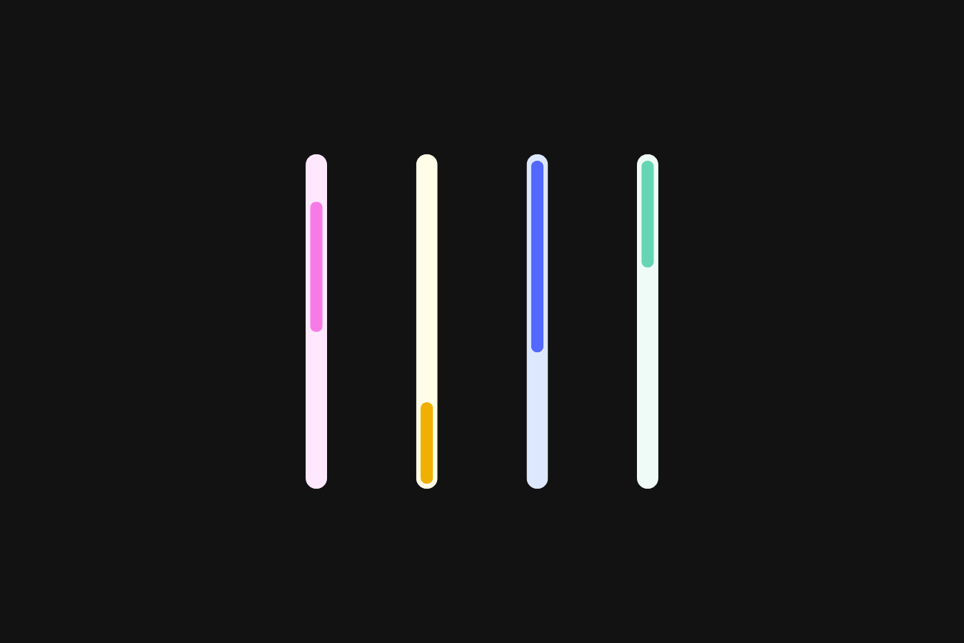
Control How the Text Is Split
Use ou-fadein-text-split to control what part of the text animates.
You can set its values to:
charsto animate each characterwordsto animate each wordlinesto animate each line
If this attribute is not used, the text is split into chars by default.
Control the Starting Opacity
Use ou-fadein-text-opacity to control how visible the text is before the animation begins.
Some common values and how they feel:
0makes the text fully invisible0.5makes the text partially visible1means the text is fully visible from the start
If this attribute is not used, the default opacity is 0.2.
Control Text Stagger
Use ou-fadein-text-stagger to control the delay between each split character, word, or line during the animation.
Important things to know:
- A value of
1animates items one after another with almost no overlap - Lower values create a smoother, more overlapping animation
- If no value is provided, each mode uses its own default:
- Scroll mode:
0.1 - Reveal mode:
0.02
- Scroll mode:
This attribute does not control total animation duration, only the spacing between items.
Control When the Animation Starts
Use ou-fadein-text-start to control when the animation begins based on the element’s position in the viewport.
For example:
top 90%starts the animation when the top of the element reaches 90% of the screentop 80%starts it a bit earliercenter bottomwaits until the element is deeper in viewtop+=100 bottomadds extra offset before starting
If this attribute is not used, the default start position is top 90%.
Control When the Scroll Animation Ends
(Scroll mode only)
Use ou-fadein-text-scroll-end to control where the scroll-based animation finishes.
How it affects the feel:
- A larger distance between start and end creates a longer, smoother reveal
- A shorter distance makes the animation finish faster and feel sharper
If this attribute is not used, the animation ends at center 40%.
Control Scroll Reverse Behavior
(Scroll mode only)
Use ou-fadein-text-scroll-reverse to control what happens when the user scrolls back up.
You can set its values to:
trueto let the animation reverse smoothly with the scrollfalseto let the animation play once and stay visible
If this attribute is not used, reverse behavior is enabled by default.
Control the Reveal Duration
(Reveal mode only)
Use ou-fadein-text-reveal-duration to control how long each split item animates (character, word, or line).
Important things to know:
- The duration applies per item, not to the whole text
- All items animate with the same timing, regardless of text length
If this attribute is not set, the default duration is 0.3 seconds.
Control the Reveal Easing
(Reveal mode only)
Use ou-fadein-text-reveal-ease to control how the reveal animation feels.
You can set its values to easing strings like:
power2.outfor a clean, natural finishexpo.outfor a more expressive motion
If this attribute is not used, the default easing is expo.out.
You can find many more easing options in the GSAP easing documentation if you want to fine-tune the motion further.
Add a Delay Before the Reveal
(Reveal mode only)
Use ou-fadein-text-reveal-delay to control how long the reveal animation waits before starting after the element enters the viewport.
Important things to know:
- The delay applies to the entire reveal, not individual characters
- It does not change stagger timing or animation duration
Use a reveal delay when you want text to animate after another element finishes, such as waiting for an image, icon, or section intro animation to complete.
If this attribute is not used, the default value is 0.
Adjusting the Default Behavior
If you want, you can also adjust the base behavior directly in the code.
This lets you change how ou-fadein-text-element behaves globally, without needing to add attributes to every element.
This is useful if you want to set a different baseline for your project and then only use attributes when you need exceptions. It gives you a clean setup where most elements just work out of the box, while still allowing fine control when required.
const DEFAULTS = {
  split: "chars",            // chars | words | lines
  anim: "scroll",            // scroll | reveal
  start: "top 90%",          // viewport start position
  opacity: 0.2,              // starting opacity before animation

  scroll: {
    end: "center 40%",       // where scroll animation ends
    stagger: 0.1,            // stagger for scroll
    reverse: true            // allow reverse on scroll up
  },

  reveal: {
    duration: 0.4,           // duration per split item
    stagger: 0.02,           // stagger for reveal
    delay: 0,                // delay before reveal starts
    ease: "expo.out"         // reveal easing
  }
};