


Info
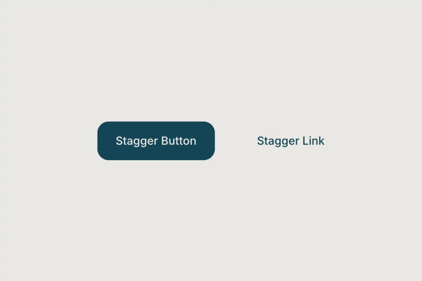
A staggered button hover effect where text characters slide out one after another while a duplicate slides in behind them, creating a smooth rolling transition.
Required
Setup
Copy structure to Elementor
Right-click in Elementor, choose “Paste from another site,” and while the popup is open, press cmd/ctrl + v to insert the layout.
Add External Scripts
Place the scripts before the body tag of your project. If you have added them before for another setup, skip this step.
<!-- GSAP Core -->
<script src="https://cdn.jsdelivr.net/npm/gsap@3.15/dist/gsap.min.js"></script>

<!-- GSAP SplitText -->
<script src="https://cdn.jsdelivr.net/npm/gsap@3.15/dist/SplitText.min.js"></script>Add Custom Javascript
Paste the script through Elementor → Custom Code and set it to load after the closing body tag.
document.addEventListener("DOMContentLoaded", () => {

  if (document.body.classList.contains("elementor-editor-active")) return;
  if (window.matchMedia("(hover: none), (pointer: coarse)").matches) return;

  const defaultAnim = {
    direction: "up",
    duration: 0.45,
    amount: 0.015,
    from: "start",
    ease: "power3.out",
    split: "char",
    reverse: true,
    reverseDelay: 0
  };

  const getNum = (val, fallback) => val != null && val !== "" ? parseFloat(val) : fallback;

  document.querySelectorAll('[data-stagger-button-element="wrap"]').forEach((button) => {

    const text = button.querySelector('[data-stagger-button-element="label"]');
    if (!text) return;

    const wrap = document.createElement("span");
    text.parentNode.insertBefore(wrap, text);
    wrap.appendChild(text);

    const clone = text.cloneNode(true);
    clone.setAttribute("aria-hidden", "true");
    wrap.appendChild(clone);

    gsap.set(wrap, { position: "relative", display: "inline-block", overflow: "hidden" });
    gsap.set(text, { display: "block" });
    gsap.set(clone, { display: "block", position: "absolute", left: 0, top: 0 });

    const splitKey = button.dataset.staggerButtonSplit === "word" ? "words" : "chars";

    const direction = ["up", "down"].includes(button.dataset.staggerButtonDirection)
      ? button.dataset.staggerButtonDirection
      : defaultAnim.direction;

    const duration = getNum(button.dataset.staggerButtonDuration, defaultAnim.duration);
    const stagger = getNum(button.dataset.staggerButtonAmount, defaultAnim.amount);

    const from = ["start", "center", "end", "edges", "random"].includes(button.dataset.staggerButtonFrom)
      ? button.dataset.staggerButtonFrom
      : defaultAnim.from;

    const ease = button.dataset.staggerButtonEase || defaultAnim.ease;

    const reverseDelay = getNum(button.dataset.staggerButtonReverseDelay, defaultAnim.reverseDelay);
    const reverseAttr = button.dataset.staggerButtonReverse;

    const reverse = reverseAttr != null
      ? reverseAttr === "true"
      : defaultAnim.reverse;

    const sign = direction === "down" ? 1 : -1;
    const yOut = `${sign * 100}%`;
    const yIn = `${-sign * 100}%`;

    const splitOriginal = new SplitText(text, { type: splitKey });
    const splitClone = new SplitText(clone, { type: splitKey });

    const originalItems = splitOriginal[splitKey];
    const cloneItems = splitClone[splitKey];

    gsap.set(originalItems, { y: 0, display: "inline-block" });
    gsap.set(cloneItems, { y: yIn, display: "inline-block" });

    const tl = gsap.timeline({ paused: true });

    tl
      .to(originalItems, { y: yOut, duration, stagger: { each: stagger, from }, ease }, 0)
      .to(cloneItems, { y: 0, duration, stagger: { each: stagger, from }, ease }, 0);

    let reverseTimeout;

    button.addEventListener("mouseenter", () => {
      clearTimeout(reverseTimeout);
      tl.restart();
    });

    button.addEventListener("mouseleave", () => {
      clearTimeout(reverseTimeout);

      if (reverse) {
        reverseTimeout = setTimeout(() => tl.reverse(), reverseDelay * 1000);
      } else {
        tl.pause(0);
      }
    });

  });

});Publish and preview live
Some solutions only work on the live site. Always publish and test after each change, as results may not appear in the editor.
Required Attributes
Wrapper
Add data-stagger-button-element="wrap" to the div wrapper that contains your text element. This wrapper is the hover trigger. When the user hovers over this div, the script runs the stagger text animation for the label inside it.
Text Label
Add data-stagger-button-element="label" to the text element inside the wrapper. This is the text that gets duplicated, split, and animated.
Settings
Text Split Type
By default, the text is split by char, meaning each character animates one after another. You can adjust this by adding data-stagger-button-split="VALUE" to the main wrapper. Possible values are char and word. Use word if you want the animation to move word by word instead of letter by letter.
Animation Direction
By default, the animation direction is up, meaning the original text moves upward and the cloned text comes in from below. You can adjust this by adding data-stagger-button-direction="VALUE" to the main wrapper. Possible values are up and down.
Animation Duration
By default, the animation runs at 0.45 seconds. You can adjust the speed by adding data-stagger-button-duration="VALUE" to the main wrapper. The value should be a number in seconds, such as 0.3, 0.45, or 0.6. Lower values make it faster, higher values make it slower.
Stagger Amount
“Stagger” means each character or word starts slightly after the previous one instead of all moving at the same time. This creates the cascading text effect.
By default, the stagger amount is 0.015 seconds between each character or word. You can adjust this by adding data-stagger-button-amount="VALUE" to the main wrapper. The value should be a small decimal like 0.01, 0.015, or 0.03. Smaller values feel tighter and faster, while larger values create a stronger wave effect.
Stagger From
Controls where the animation starts from within the text sequence. By default, the animation starts from the beginning (first character or word). You can adjust this by adding data-stagger-button-from="VALUE" to the main wrapper.
Use end to animate from the last character, center to animate outward from the middle, edges to animate from both ends toward the center, or random for a more chaotic effect.
Animation Ease
By default, the animation uses power3.out easing. You can adjust this by adding data-stagger-button-ease="VALUE" to the main wrapper. The value can be any valid GSAP ease, such as power2.out, power3.out, or power4.out.
Reverse on Mouse Leave
By default, reverse is set to true, so the animation smoothly reverses back to its original state when the mouse leaves. You can adjust this by adding data-stagger-button-reverse="VALUE" to the main wrapper. Possible values are true and false. Set it to false if you want the animation to reset instantly instead of reversing.
Reverse Delay
By default, the reverse delay is 0 seconds. You can adjust this by adding data-stagger-button-reverse-delay="VALUE" to the main wrapper. The value should be a number in seconds, such as 0, 0.1, or 0.2. This only matters when data-stagger-button-reverse="true" is enabled.
Global Default Values
You can also adjust the default global values directly from the script. These values apply to every stagger button unless you override them with attributes on the main wrapper.
To change the default animation behavior across all elements, edit the values inside the defaultAnim object in the code.
const defaultAnim = {
    direction: "up",
    duration: 0.45,
    amount: 0.015,
    from: "start",
    ease: "power3.out",
    split: "char",
    reverse: true,
    reverseDelay: 0
};