


Info
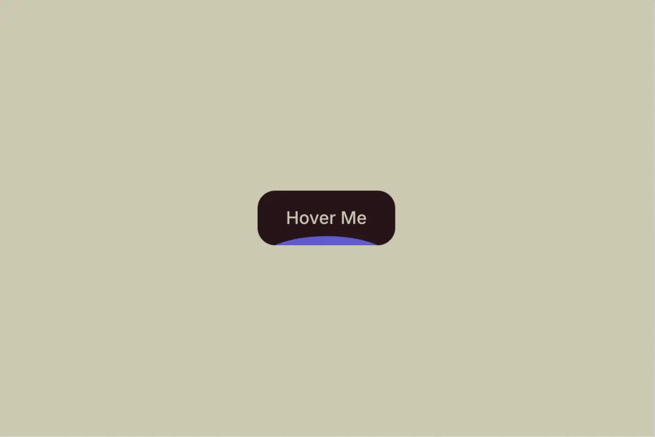
A curved background shape animates upward on hover, covering the button to create a smooth fill effect.
Setup
Copy structure to Elementor
Right-click in Elementor, choose “Paste from another site,” and while the popup is open, press cmd/ctrl + v to insert the layout.
Add Custom CSS
Paste the code through the page or site settings, or add it via Elementor → Custom Code before body tag.
@media (hover: hover) and (pointer: fine) {
  [data-bg-fill-bt="button"]:hover [data-bg-fill-bt="background"] {
    transform: translateY(0);
    border-radius: 0;
  }
}Publish and preview live
Some solutions only work on the live site. Always publish and test after each change, as results may not appear in the editor.
How it works
The button uses a wrapper with the attribute [data-bg-fill-bt="button"], and its width is set to auto so it naturally adjusts to the size of its content. Inside it, there is a background layer [data-bg-fill-bt="background"] that is positioned absolutely, allowing it to move freely without affecting anything.
The wrapper is set to overflow: clip, which keeps the background animation contained within the button. Without this, the background would slide outside the button during the animation and break the visual effect.
By default, the background sits below the button using translateY(100%) and has a 50% border radius, giving it that curved shape. On hover, it moves up to translateY(0) and the border radius becomes 0, smoothly filling the button.
All styling like colors, spacing, and transition timing can be controlled directly in the editor. The CSS simply handles the hover state.